Art direction is not really about art.
Hello and welcome to the first entry of A2D. I want to talk about how art direction is not really about art. Instead, I want to argue it is design instead, and why that distinction is important.
Is it not?
Okay let me explain. Of course it's about art. But really art direction is art design. It’s design because the game’s art is not art for its own sake. Good game art serves a higher purpose, reinforces the game’s message, mechanics, experience; its pillars.
Consider a regular floor texture. Few people would consider framing that texture, hanging it on their wall, let alone buy a museum ticket to go see it. Simply creating beautiful game art does not make people invested in your game. In the worst case, the art in your game is considered distracting. On average, your “good graphics” are considered a plus. But great art direction helps people stick around for hours on end.
The humble floor texture is there to serve that higher purpose. Individually, the textures don’t care if people consider them pretty. But through their detail, palette, and shading they inform the player of the mood, the story, the walkable path. They tell them the age of the house, or the location of an untimely NPC death. They could be made in a two-tone pixel art style, or in high definition 4k PBR glory.
If the floor texture’s only purpose is to be extremely beautiful, if they are art for art’s sake, no one would play the game for long. Considering the average person looks at the Mona Lisa for about 15 seconds, your graphics have to be astonishingly interesting to warrant hours of playtime. Also consider games like Minecraft, Roblox, or The Sims, whose graphics are generally not on anyone's top 10, yet which are played to infinity.
The visual clutter problem
In recent times the topic of visual clarity has come to the foreground. As graphics become more and more realistic, good looking art can get in the way of visual clarity and impact the gameplay negatively.
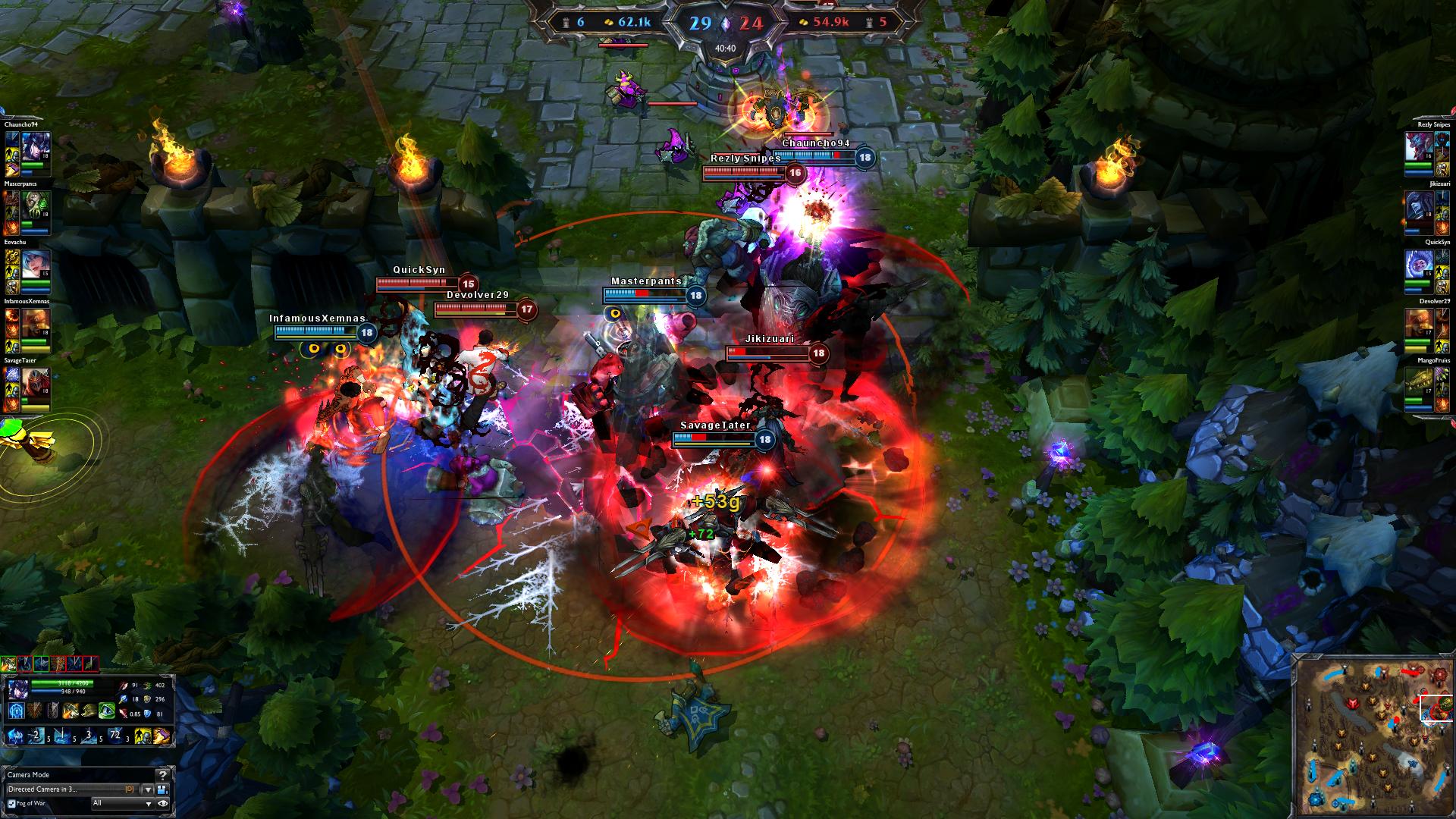
When games get too focused on making beautiful art, gameplay can be affected in bad ways. This is particularly important in competitive games. Youtuber TheXclusiveAce has some really good examples of how a certain skin completely blended in with the environment, making it nigh impossible for players to discern her from the background. League of Legends developer Riot Games shares extensive articles detailing their ongoing attempts to improve visual clarity during fights.
Youtuber Matthewmatosis says about God of War:
"If they (enemies) can be launched, you can even go for a wall pin which results in an instant kill. This would be great, except that you never know whether these effects will occur, because the terrain is more concerned with looking nice than providing a clear battlefield for you to work with."
In Robh Ruppel's GDC talk you can see that most of the art director's work during production is overpainting level geometry to improve visual clarity.
Designing the art
As art directors, we need not to busy ourselves making beautiful art, but about designing said art that reinforces the game’s pillars. Every pixel is designed to tell the player something, have them feel something that suits the game’s needs.
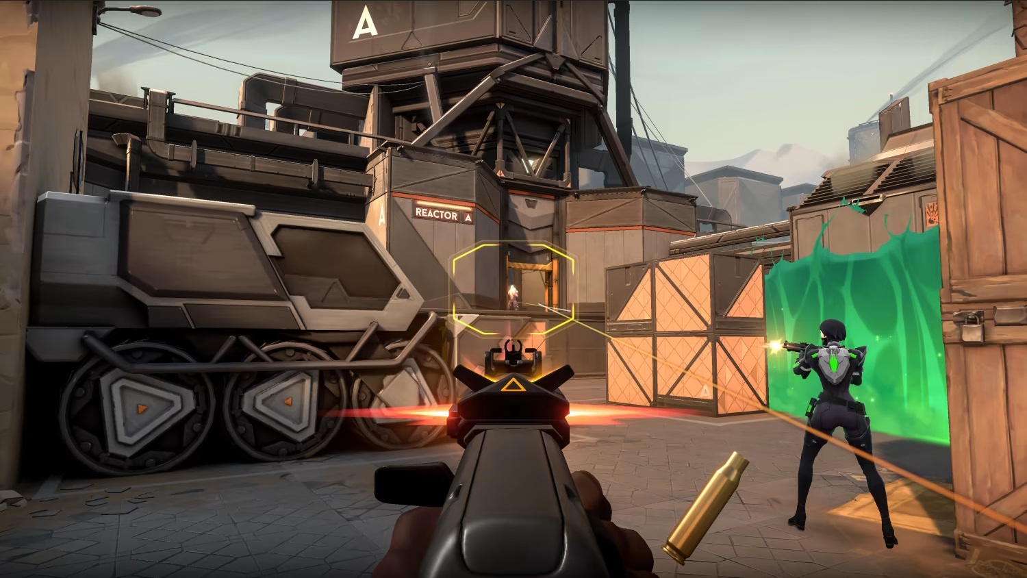
In this interview Moby Francke, legendary art director of Team Fortress 2 and Valorant, says something very interesting:
“While early iterations of Valorant had a more realistic look, Francke wanted the art to complement but not overshadow the gameplay, prompting the shift to a simpler and more vibrant style.”
Moby Francke has worked primarily, if not solely, on (competitive) first person shooters, so it makes a lot of sense that he values visual clarity above all else.
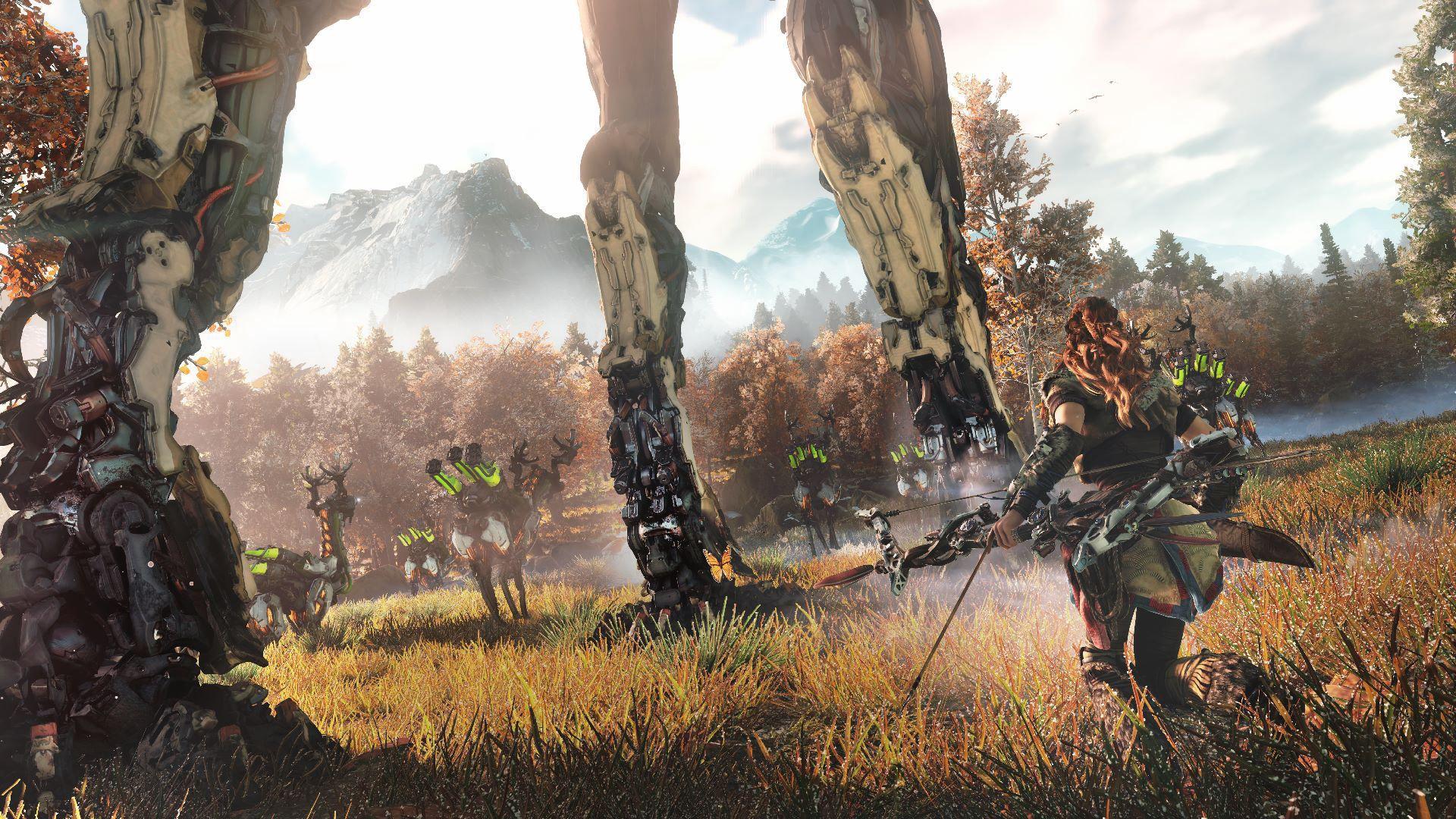
His art direction is hugely influenced by the game’s design. But this is not limited to competitive shooters alone! We can spot the same principle at work in Horizon Zero Dawn (HZD), a game lauded for its stunningly beautiful visuals. In his GDC talk Guerrilla Games’ studio art director Jan Bart van Beek explains the core pillars of HZD’s game design.
“Explore the majestic wilderness growing on the mysterious ruins of a post-post-apocalyptic far-future america where machines have become the dominant lifeform. Experience the compelling stories, rich cultures and memorable characters of a tribal mankind and save them from the brink of extinction.”
Jan Bart then explains that from these pillars, the art direction team extracted that they needed to design a whole bunch of rich and diverse cultures, set in this incredibly lush and overgrown world filled with ancient ruins and animalistic machines. HZD’s lead designer Eric Boltjes echoes this in a different GDC talk:
“Four major design goals: majestic wilderness in a post-post-apocalyptic world, awe inspiring machines, exotic tribes, and open world.”
The game's art director and the game's lead designer are in total agreement about what HZD's intended experience is, and each find their own way to express that in their departments.
HZD’s art direction isn’t fantastic because it's beautiful, it’s fantastic because the game (design) requires it to be this way.
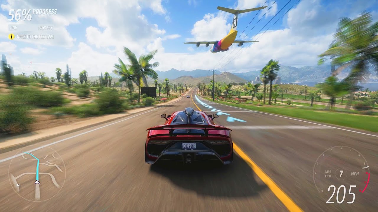
While it might seem obvious, the genre of your game also hugely impacts the art direction. In a 2017 GDC session, Playground Games' Jamie Wood explains:
“When you’re driving at about 100mph, what is really important on the screen? The car, the road, and the sky are the only constant factors.”
This is the perfect reason why the art team spent such an insane amount of time and effort on the skies in the Forza games. I would’ve definitely spent way more comparative effort in the surrounding landscapes and architecture, which is actually a blur during 99% of playtime.
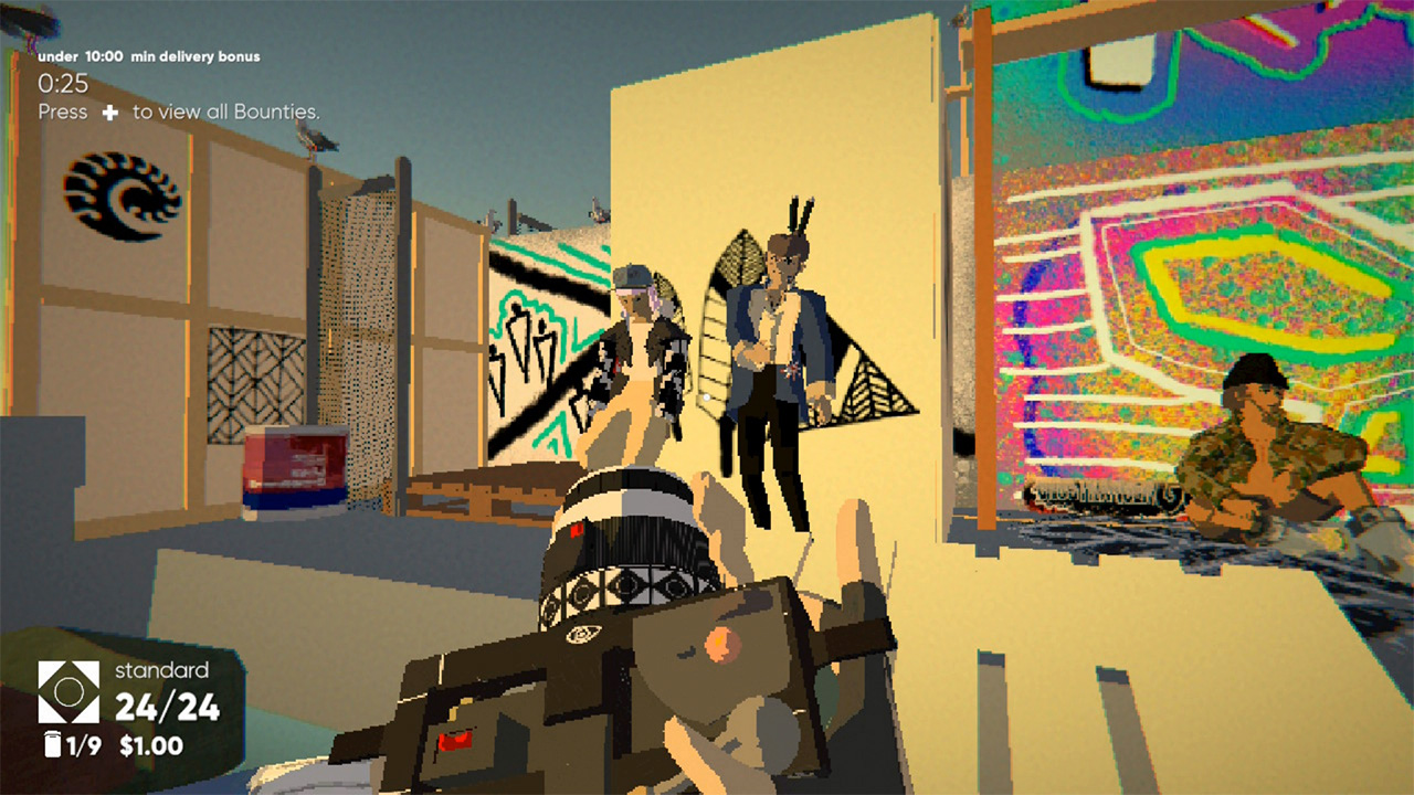
Compared to the games above, a game like Umurangi Generation is, for lack of a better word, ugly. By all accounts this game’s art is weird, incoherent, unpolished, and seemingly thrown together. Only by playing the game do you discover that actually this is all by design. On its Wiki page it states that creator Naphtali Faulkner has described the aesthetics of Umurangi as “shitty future”. For a deeper look, check out Jacob Geller's video in defence of “bad graphics”.
Notable exceptions
Now there are certain games and genres that completely disregard this whole approach. Most notably point and click games and visual novels can be much more art for art’s sake. These games generally (and unfortunately) do not hold mass market appeal, which could be a very important factor for a studio.
Contemporary pixel art is a tricky one here. My theory is that with the rise of indie games in the early 2000s, a lot of older genres like 2D platformers made their return, bringing their aesthetics with them. New pixel art games like The Last Night make use of the latest lighting and rendering techniques, turning the formerly retro-aesthetic on its head. In this article the developers mention that first and foremost, pixel art was chosen for its ease of implementation and simplicity, especially since the prototype for The Last Night was first created during a game jam.
Moby Francke captures the sentiment perfectly in his bio on theorycraft:
“It’s not art for art’s sake. It’s not art for personal enjoyment. It’s art because you’re trying to make a product that sings to millions of players around the world. And the word players is important. It’s not a visual experience, it’s a GAME! I’m looking for artists that want to really be game developers.”
Real xp
I have lead a project where I just wasn't able to align the visual design with the core experience. The result was, despite the 3D artists' best efforts and two months of production time, underwhelming. Conversely, in a project with only a two week production time, the aesthetics clicked together perfectly with the brand's experience, making it a much better looking project.
Listen to the game, your colleagues, their wants and needs. More likely than not, the art can support whatever message it is they want to tell without compromising on its quality. Remember, good graphics are not about shader complexity or polycount, but about expressing the game's pillars.
Thanks for reading. Please tweet or email me if you have any comments/opinions/questions, I’ll be happy to engage with you.
Further reading/watching
A fantastic deep dive into not just the graphics, but the whole entirely feel of SWAT 4, a 2005 tactical fps. In his video, Face Full of Eyes goes into great detail about the game’s art, its environmental storytelling, and what the game art tells the player on a micro and macro level. His essay really reinforced my thoughts about art direction being not just about the pretty pixels, but also their relation to the game and the narrative.